“The Nothing Phone 1 is quirky, unusual, and eye-catching — all in a good way. From the LED lights to the simple software, there’s a lot to like.”
- Quirky and unusual design
- Slick, easy-to-use software
- Glyph Interface is eye-catching
- Main camera takes good photos
- Wireless charging
- Short battery life
- Inconsistent wide-angle camera
- Android 13 still in beta
Trying to separate the Nothing Phone 1 from the hype around it is a difficult task. The involvement of Carl Pei, the OnePlus co-founder with a significant following in the tech community, meant a lot of people were very excited about this phone. But as it was teased relentlessly for months ahead of launch, many felt jaded and even had some negative preconceived ideas about it, and no amount of bright, flashing lights could change that.
Pushing all this aside, what’s the Nothing Phone 1 actually like? It’s good, but not because of the LED light show on the back.
Nothing Phone 1 design
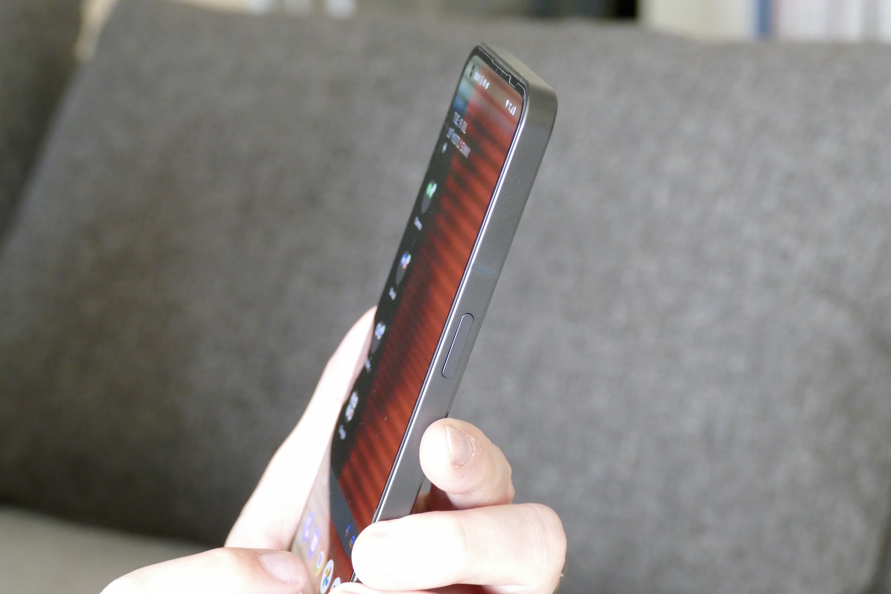
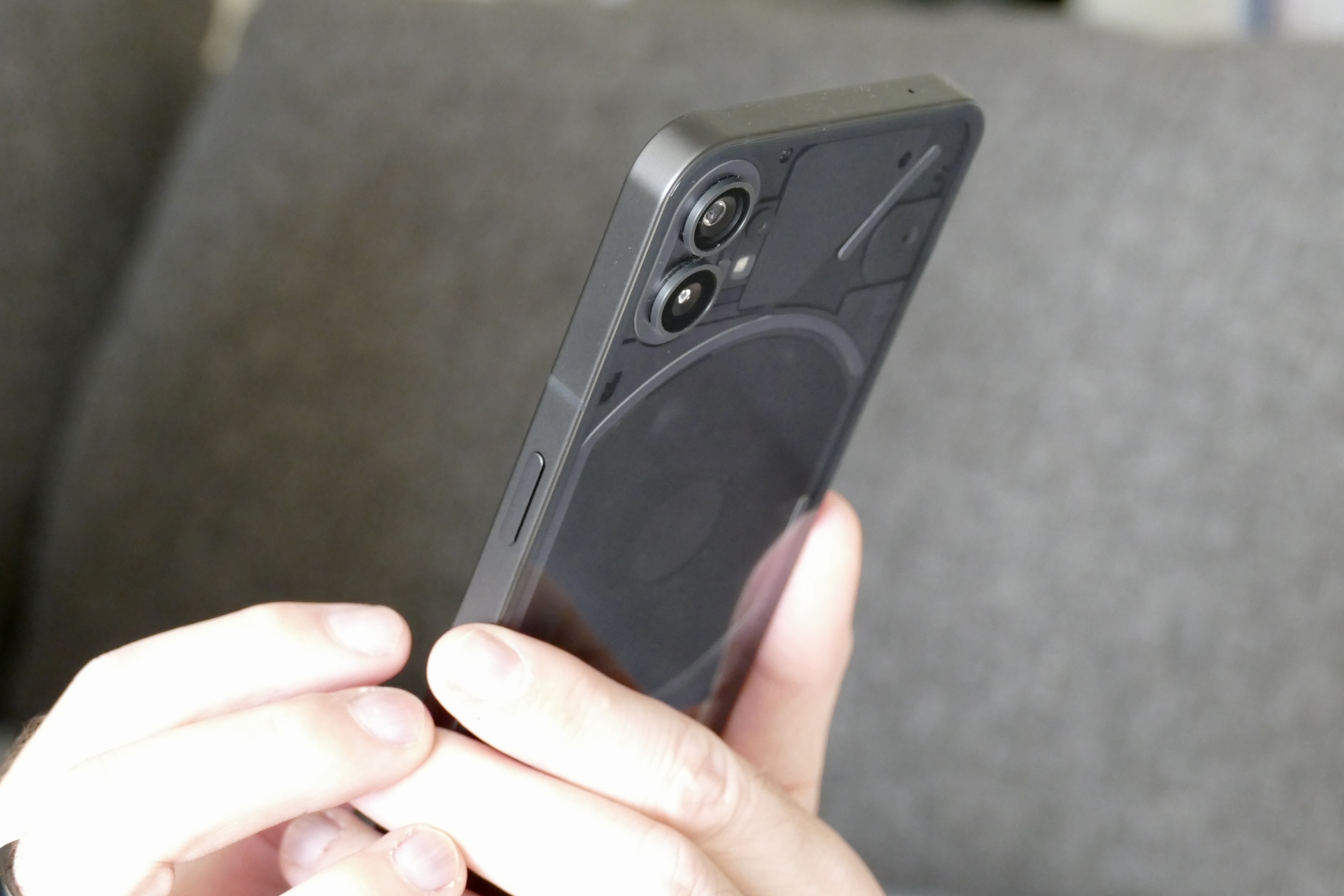
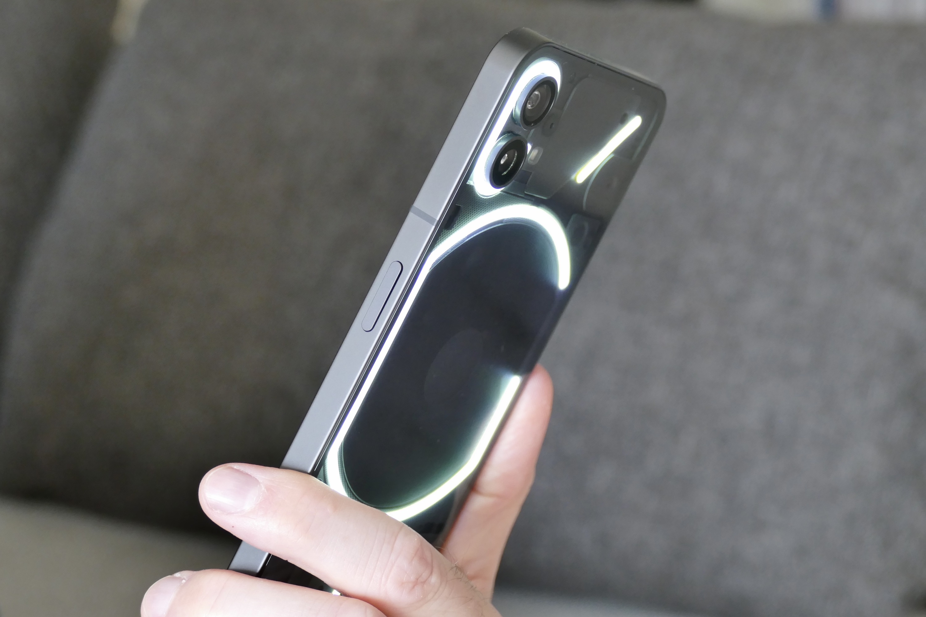
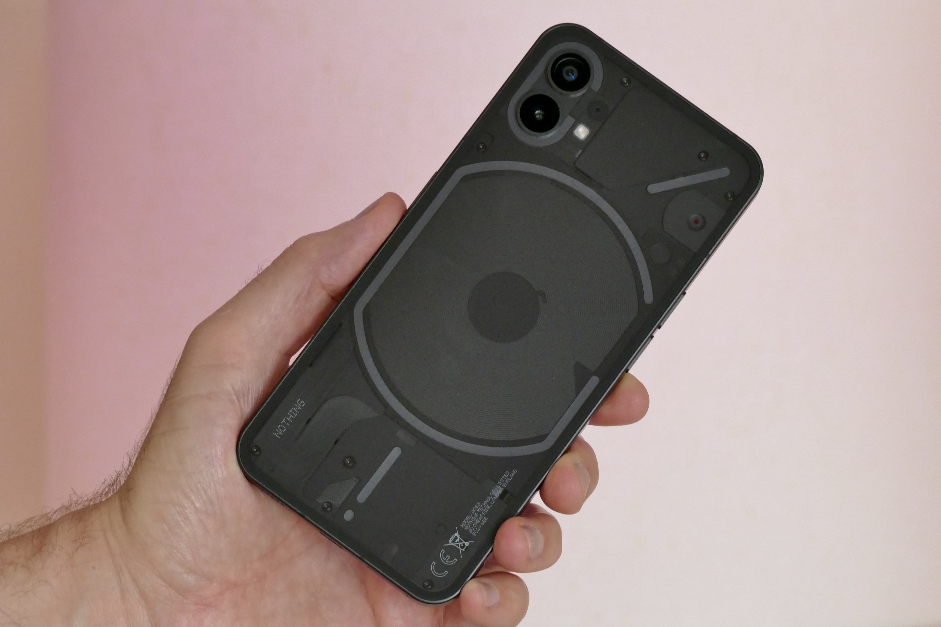
The Nothing Phone 1 looks nothing like any other phone available at the moment. Sure, glass on the front and back sandwiches a metal chassis, but the rear of the phone is transparent. Because of this, it shows the internal components and is lit up by Nothing’s fancy Glyph LED lights. Ignore the naysayers — it’s fun, special, and downright cool. The phone comes in black or white color schemes, is 8.3mm thick, and weighs 193 grams. It’s sensible to use with one hand, it’s not too bulky or thick, and it slips into most pockets and bags without a fuss.

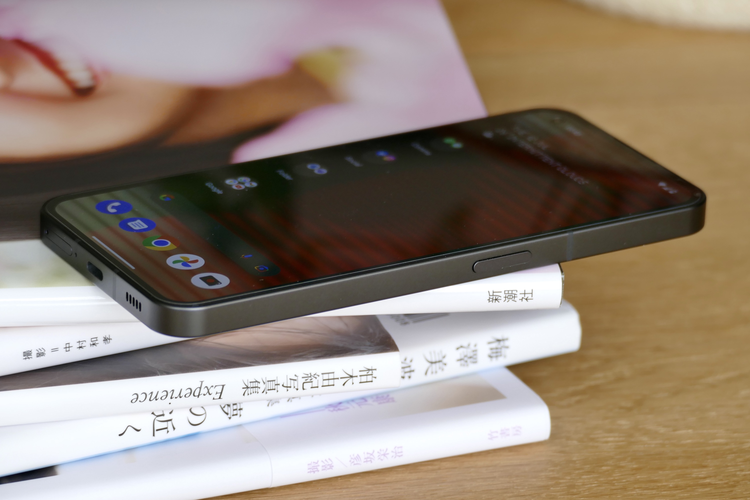
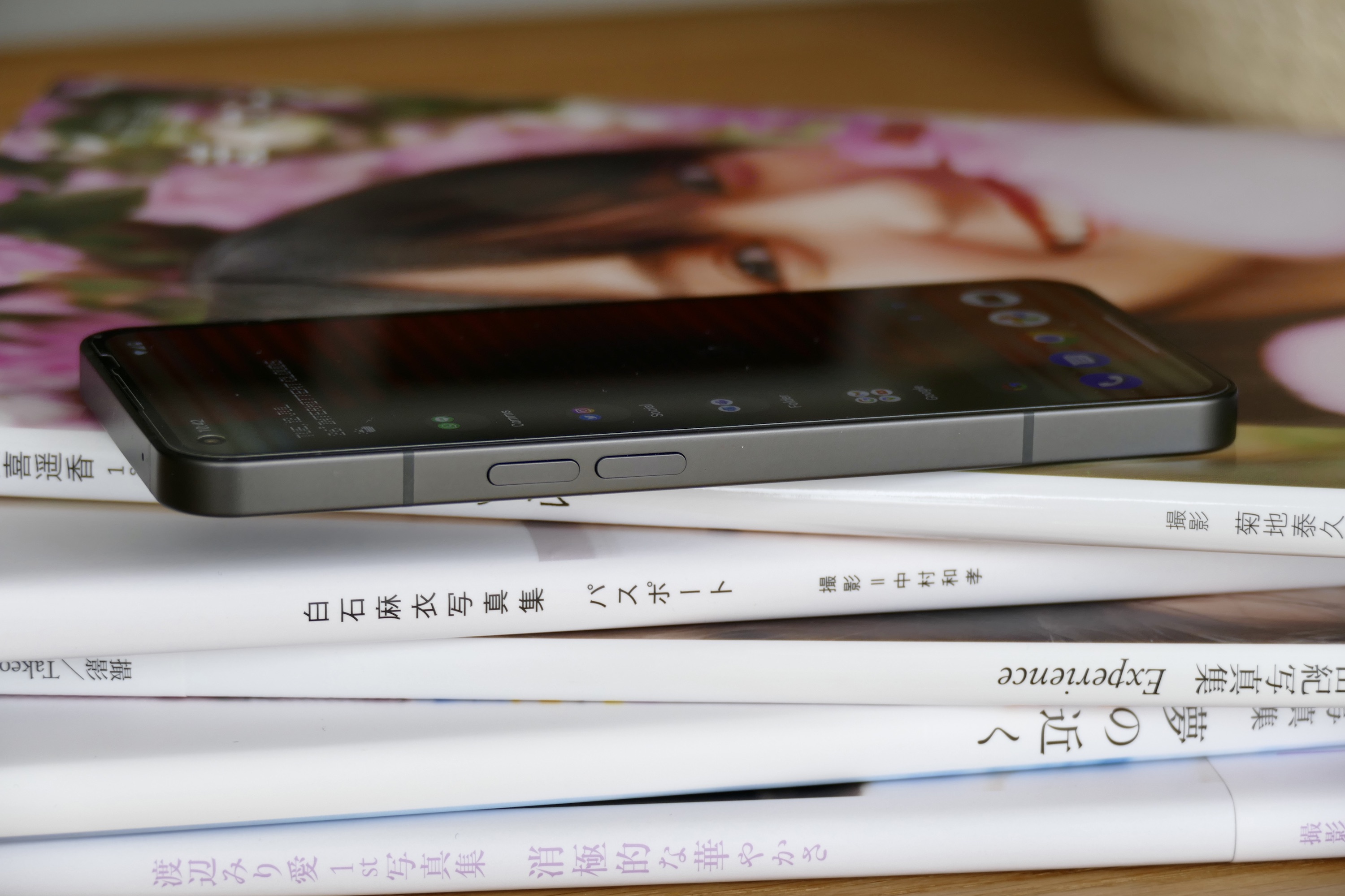
The flat-sided metal body looks very slick, but it’s not that comfortable to hold for extended periods, much like the iPhone 12 and iPhone 13 it’s so clearly imitating. There is a hint of a chamfered edge, but it’s not enough to make the phone as comfortable to hold as the Xiaomi 12 Lite, which shares a similar design. The phone’s 193-gram weight is just right, though, making it pocketable and never fatiguing to hold. I was sent a transparent case for the Nothing Phone 1, which I’ve found reduces the way the phone digs into your palm and have used it all the time. I’d consider it a must-buy if you get the phone.
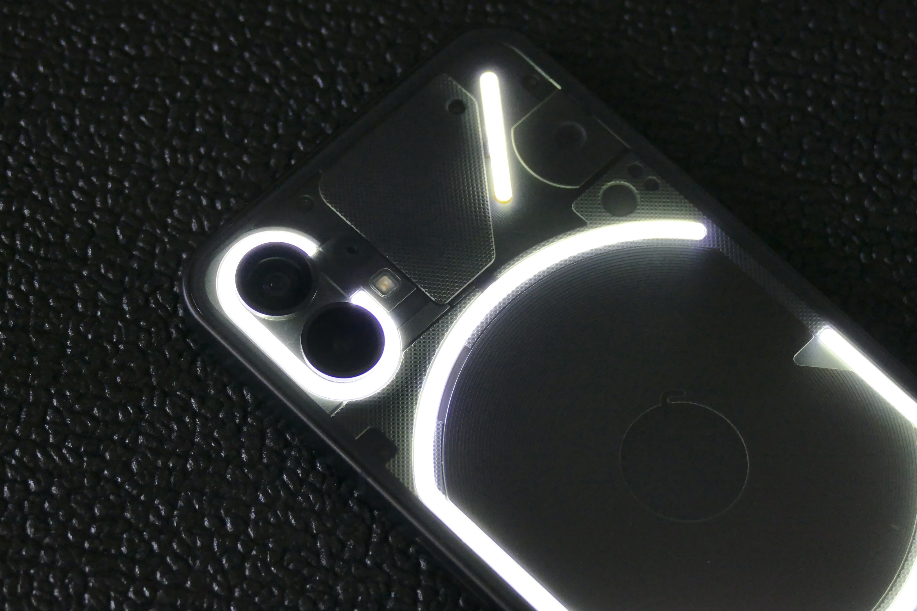
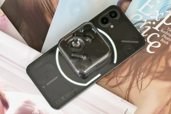
The transparent back of the Nothing Phone 1 looks ace. All the phone’s guts are actually covered up, leaving the wireless charging coil as the only naked component on show. That may disappoint some folks at first, but in reality, it’s a good thing. Components are usually ugly, and aesthetics aren’t taken into account when laying out the inside of a phone. Covering them up with different-shaped panels under the glass gives the Nothing Phone 1 a cool, sci-fi look.
Nothing has designed a phone that doesn’t look like any other and has a unique element that genuinely catches the eye when it’s activated. Considering this is the debut phone from a modestly-sized startup, it feels incredibly substantial and well-made. There are some who question why the Phone 1’s looks have caused a furor and dismiss it all as hype, but this is cynical and myopic.
Last year saw many good-looking smartphones emerge, yet Nothing still managed to come up with something fun and unusual. Reducing the Phone 1’s design to little more than a collection of flashing lights for people attracted by such things, or simply dismissing it as an iPhone clone, misses the point. What we’re seeing is Nothing continue to build its brand identity, which started with the Nothing Ear 1 true wireless headphones, then continued again with the Nothing Ear Stick in-ear headphones. Whether you like or loathe the look, it’s immediately recognizable. It’s fascinating to see, and very few brands start out with such a clear design vision in place, let alone after just a few products. It bodes well for the company’s future in design.
Nothing Phone 1 camera
On the back of the Nothing Phone 1 is a 50-megapixel Sony IMX766 main camera with optical image stabilization (OIS), electronic image stabilization (EIS), and an f/1.88 aperture. There’s also a 50MP Samsung JN1 wide-angle camera with EIS and an f/2.2 aperture. That’s right, just two cameras. Not three, four, or five. That must mean it’s terribly basic, right? How will it survive without a depth camera, a macro camera, or a monochrome sensor?

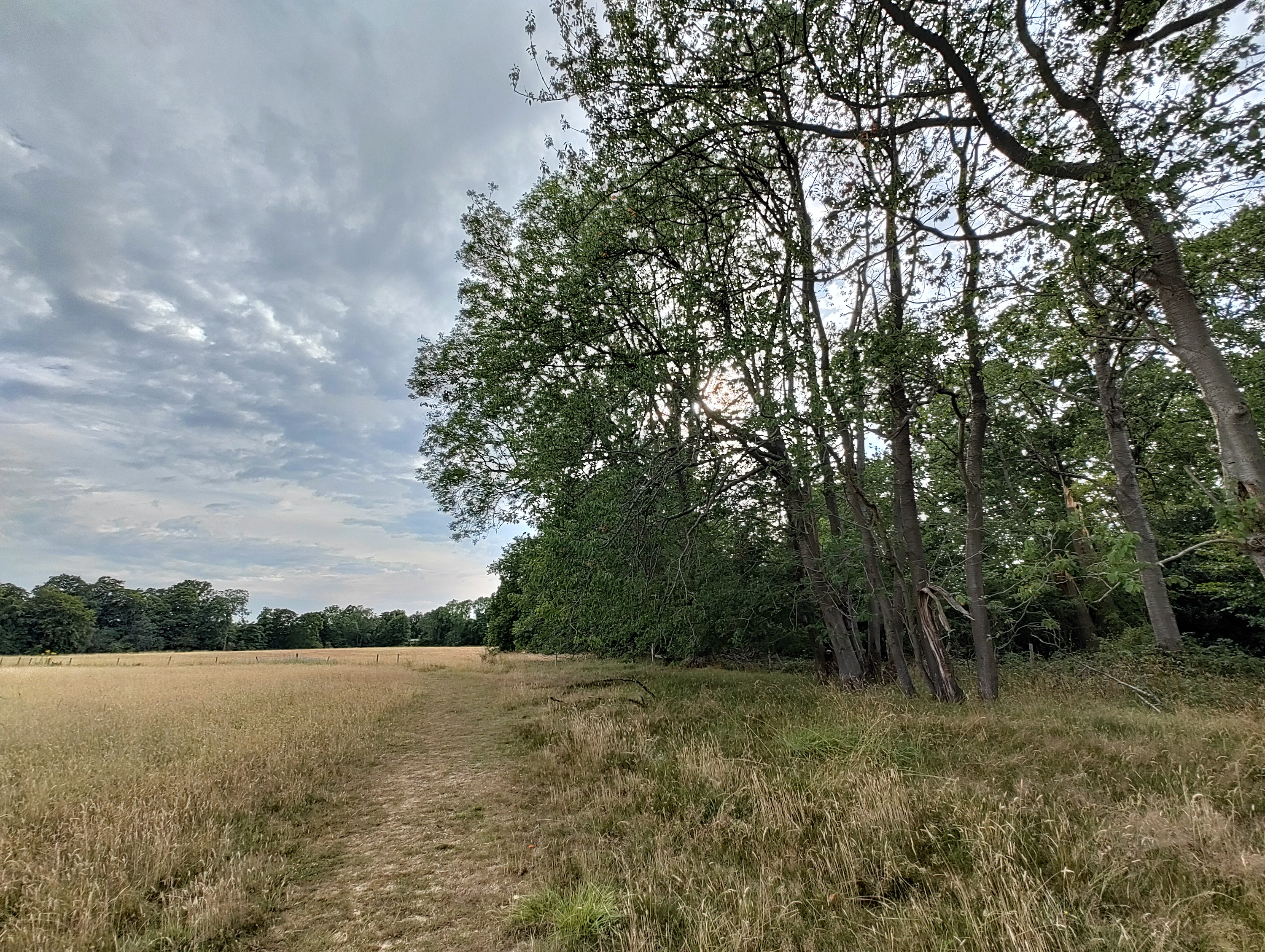
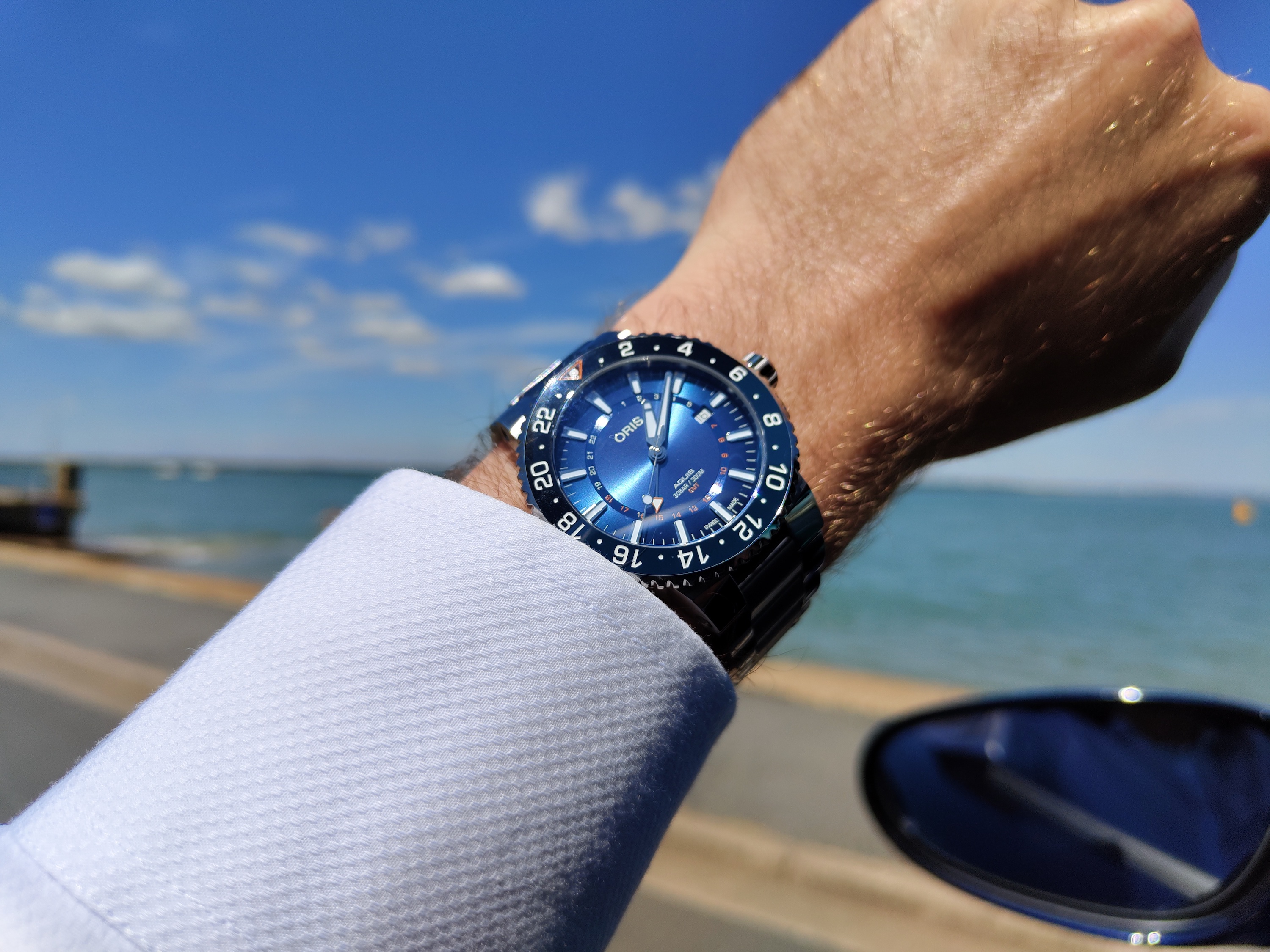
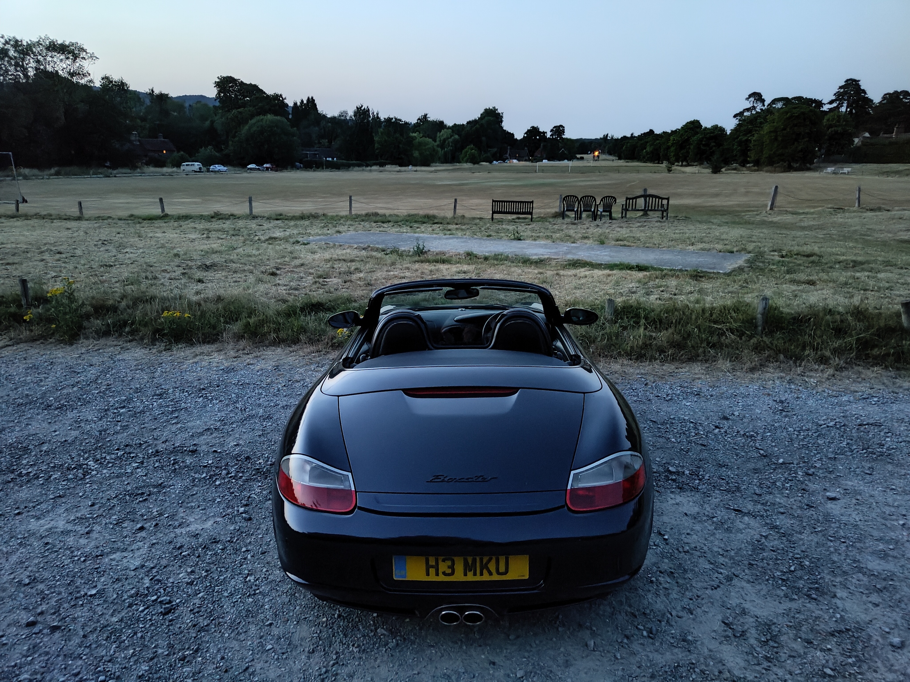
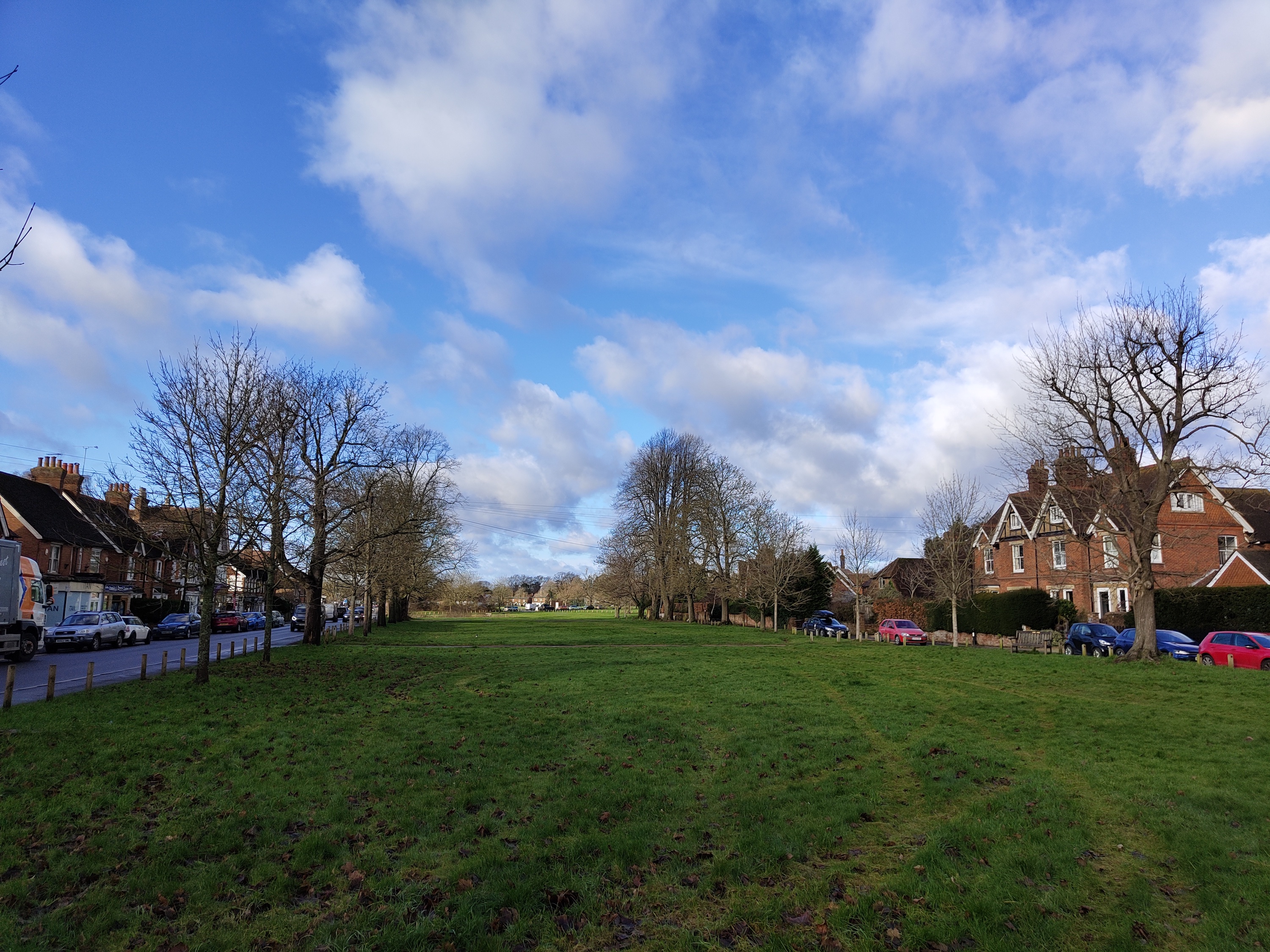
It survives just fine and is, in fact, all the better for shedding the unnecessary additional cameras. The Nothing Phone 1 can take lovely photos. It leans toward a natural color palette and further away from the saturation seen in many midrange cameras, which are designed to attract those who want to post instantly to social media. The Phone 1’s camera is more nuanced and slightly more subtle in its approach. It still amps up the blue sky but crucially leaves green mostly untouched, resulting in more realistic scenes. It’s more iPhone than Galaxy, in other words.
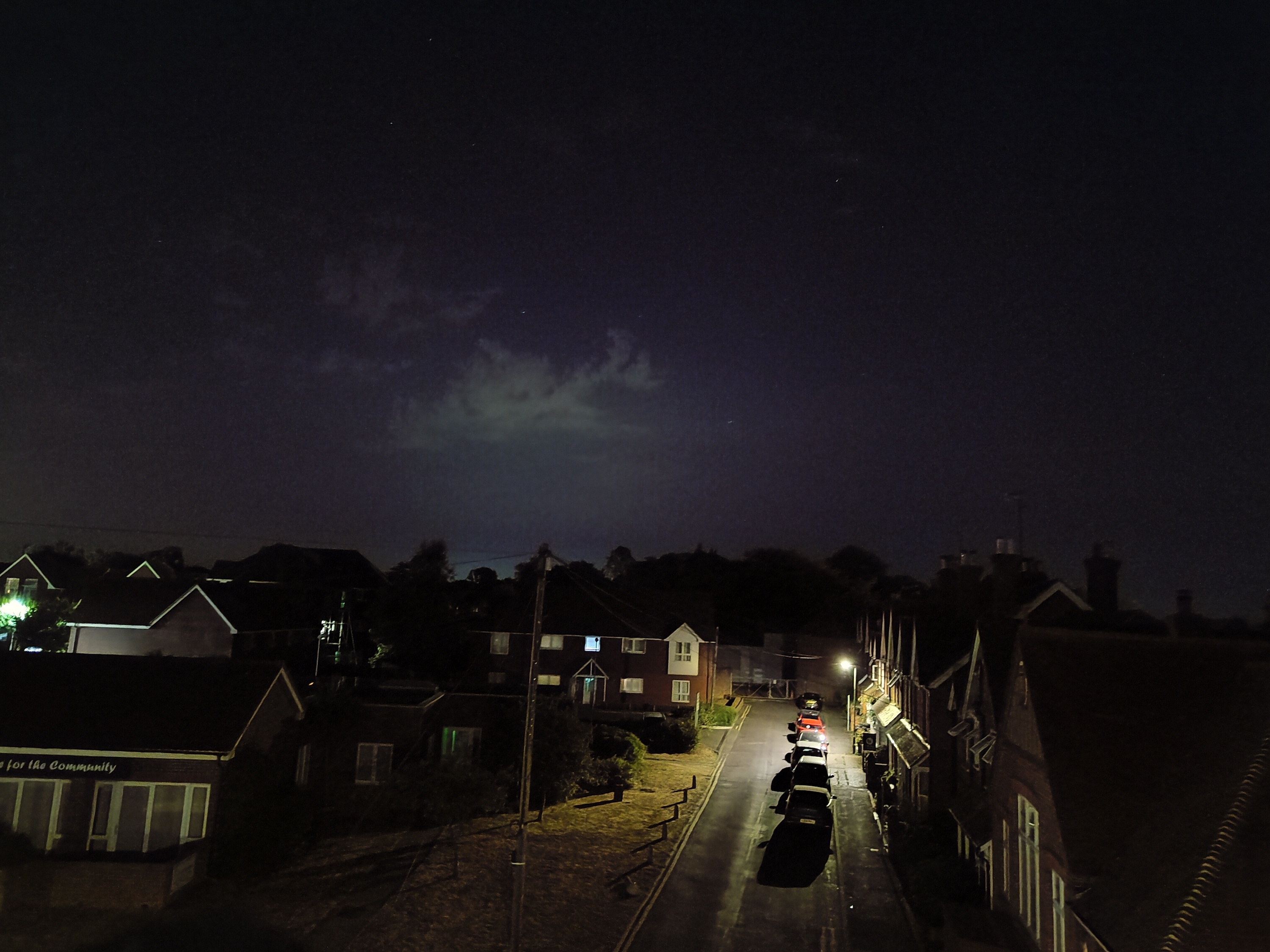
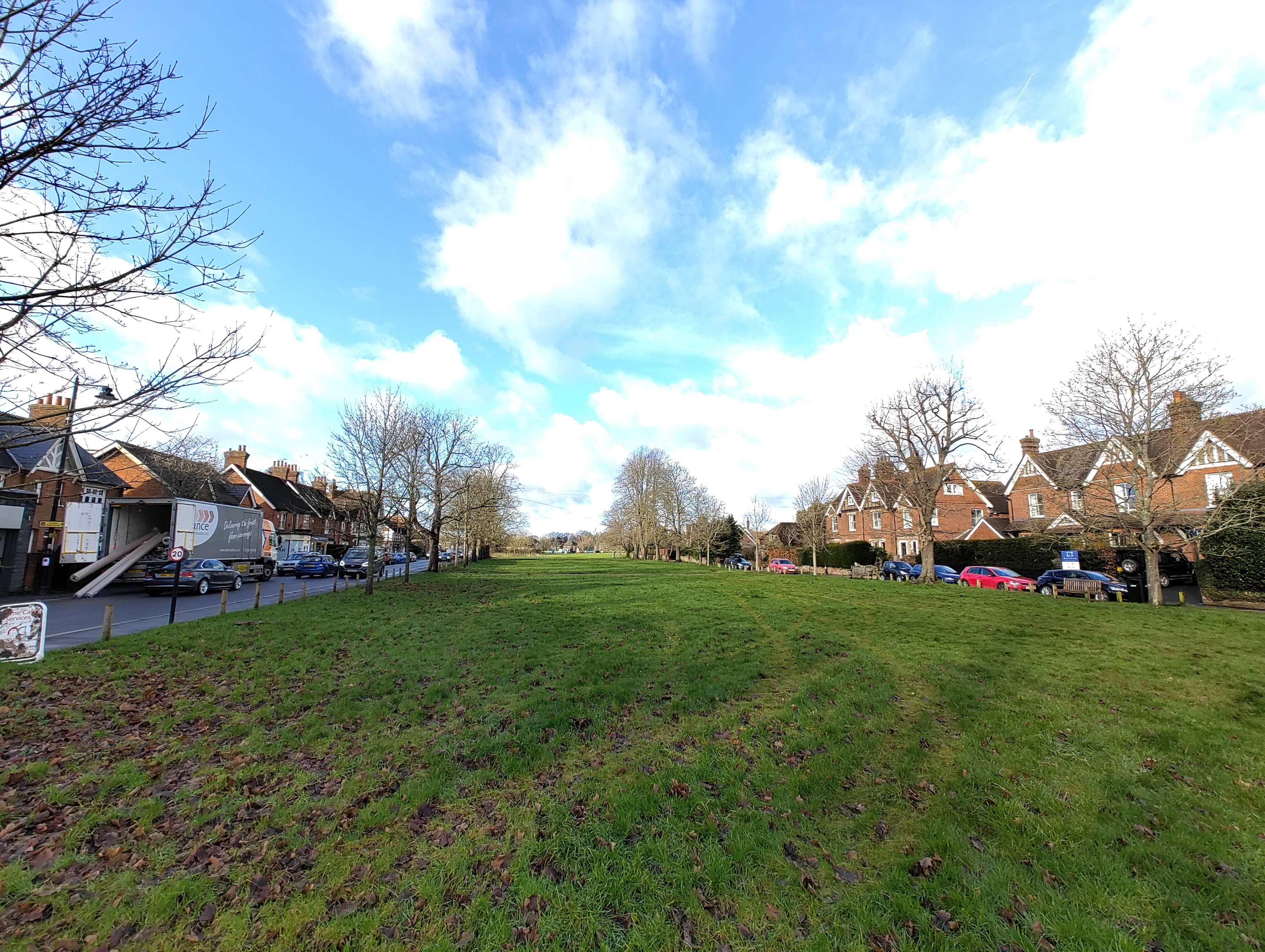
I’ve enjoyed taking photos with the Nothing Phone 1 a great deal, being particularly pleased with the natural bokeh and some lovely use of HDR. However, it is far from perfect. Indoor shots often contain quite a lot of noise when light is problematic, the reflective glass back and lighting system may introduce lens flare more than on other phones, and Night mode is very glitchy — having failed to work several times and repeatedly failed to focus. The wide-angle camera is more muted, and its photos sometimes lack the vibrancy of the main camera. It requires more tuning to bring consistency in line with the main camera. Recording 4K video — only available at 30 frames per second (fps) — isn’t as smooth as 1080p, and it appears to have an overly blue tint.
For selfies, the Phone 1 uses a 16MP selfie camera in the hole-punch cutout in the screen. Photos capture skin tone and detail well, and the portrait mode isn’t too aggressive with its artificial blur, while edge recognition is very good. You can opt to use the Glyph lights as a fill light, rather than the harsher flash, when using the rear camera to take photos of people.
Even after several updates, and with the latest Nothing OS 1.5 software, there’s still work to be done on the Nothing Phone 1’s camera, as it remains inconsistent. That said, I consider most of the photos taken with the Nothing Phone 1 to be shareable and eye-catching, but there are times when the HDR effect kicks in too much when using the wide-angle camera, stopping you from trusting the camera entirely. However, I haven’t missed additional cameras on the back, and the photos don’t seem to suffer due to their absence either.
Nothing Phone 1 Glyph Interface
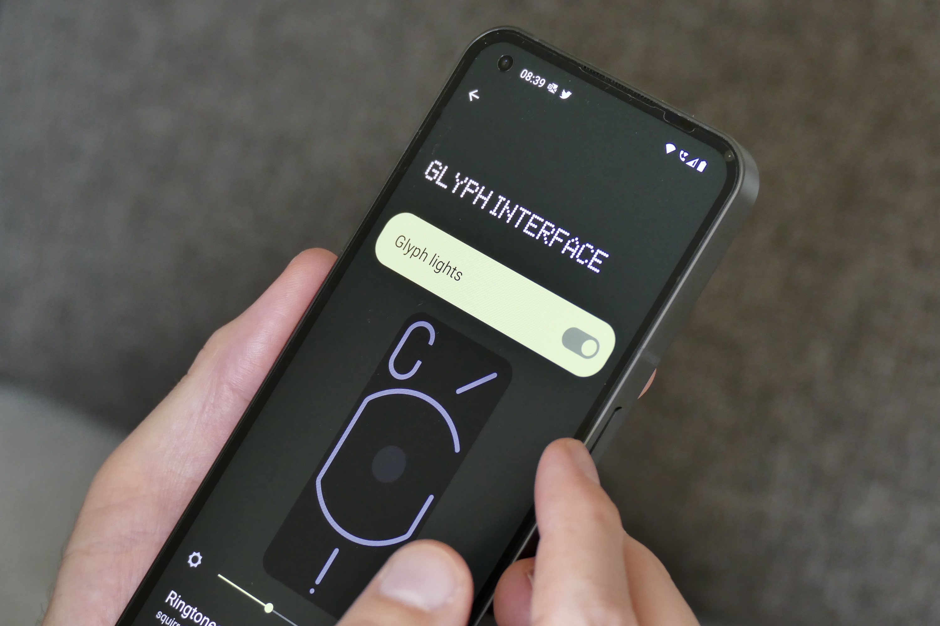
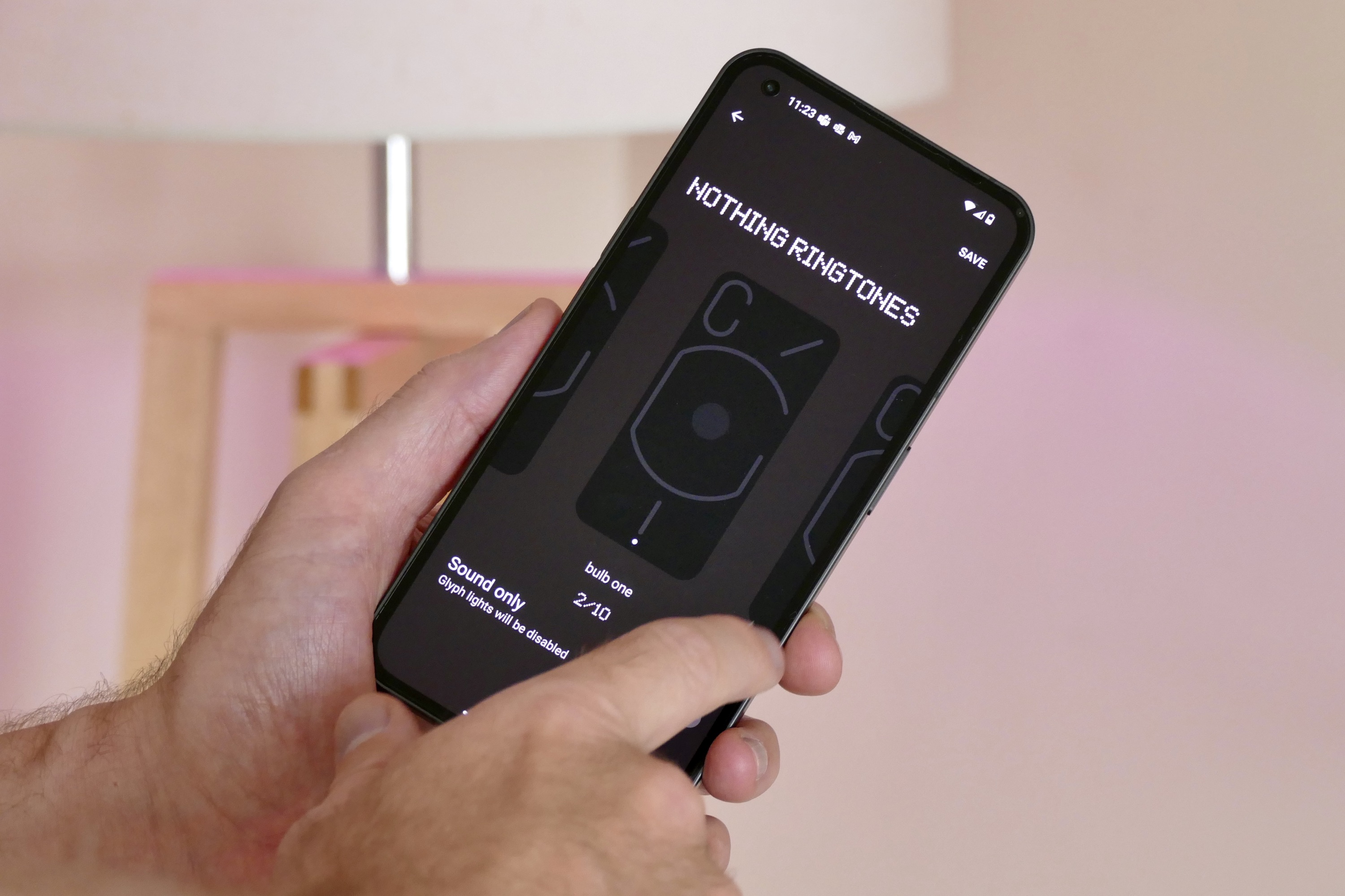
The Glyph Interface is the name given to the lights, haptics, and sound effects that make the Nothing Phone 1 unique. They activate mostly when the phone rings or a notification comes in and consist of 10 different sets of special ringtones and notification alerts, all of which flash the lights in different patterns, vibrate the phone in different ways, and make different sounds when something happens. Otherwise, the LEDs come to life to show charging status and when Google Assistant is listening, and they can be used as an alternative to the flash in the camera app.

Nothing has got the combination of lights, haptics, and sound just right. They’re distinctive and unique, and the way the phone illuminates and vibrates means there’s no mistaking it for any other phone. They do give the Phone 1 a personality, albeit a quite mechanical one, oddly reminding me of Pixar’s famous desk lamp the company used at the beginning of its films. The Glyph lights are very bright, and even at 75% brightness, some of the sharper notification alerts look like a flash of lightning in a dark room. It’s a good thing you can set a Do Not Disturb schedule.
I like the concept of the Glyph Interface a lot, and after living with the phone for a while, I have used the Flip to Glyph feature most, where putting the phone face down means the lights flash to alert you of an incoming notification. It’s eye-catching and helpful. It also means I’ve got a reason to show them off, and I don’t have to change any settings to do so.
The haptics are great (very noticeable and nicely engineered), and the sounds they accompany are a great mix of cute (the “Oi!” and tennis sounds), nostalgic (either of the bulb sounds), and weird (the excitable Scribble and Squirrels). I don’t mind having the sounds active at home, but I would turn them off in public, and I’d probably just not turn the volume back up again.
Everyone will take to the Glyph lights differently and perhaps deliberately adjust their lifestyle to suit the phone. At first, I suspected the novelty would wear off, and I’d go back to the most convenient and established way of a phone alerting me of calls and notifications (a haptic-generated buzz and the always-on screen). But the Flip to Glyph feature has fitted into my usage really neatly, stopping the lights from becoming a gimmick.
Nothing Phone 1 software
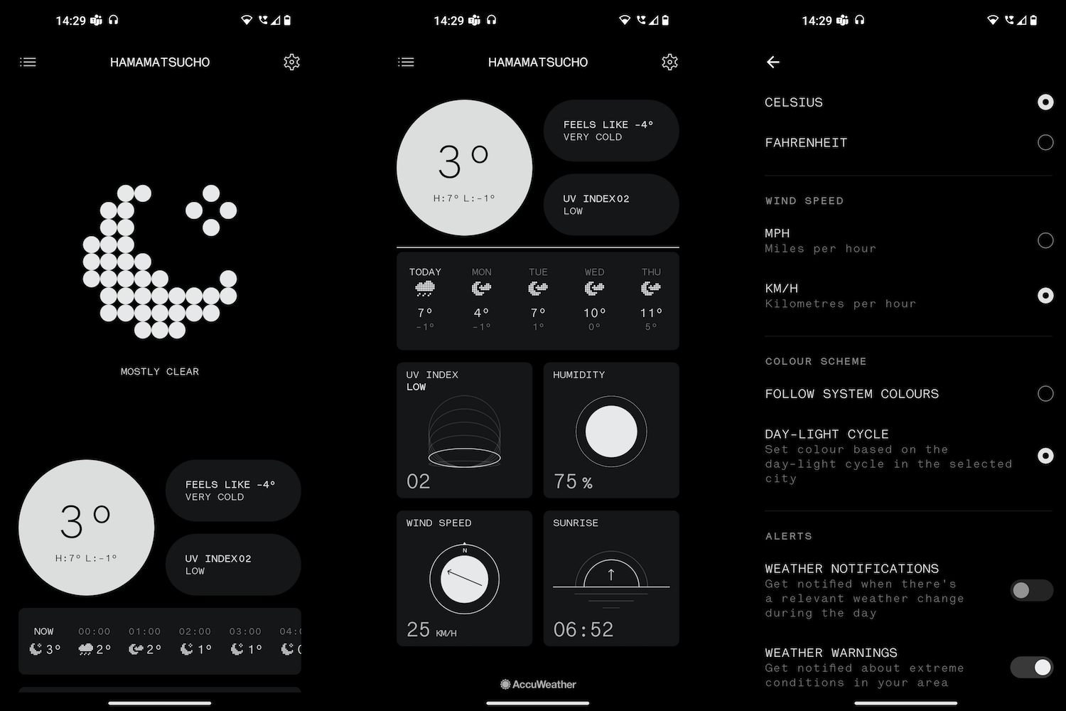
Before I started using the Nothing Phone 1, the hype around Nothing OS — the name given to Nothing’s software — had made me expect something different, new, and possibly even controversial. It’s not really any of those things, but don’t take this as a negative. Nothing OS is great — simple to learn, free from bloat and annoying interruptions, and wonderfully fast and smooth.
The software doesn’t pester you to change this setting, try that feature, or use a different app, mostly because there aren’t any superfluous apps or features. It’s a wise move on Nothing’s part and brings the Phone 1’s experience closer to that of the Pixel 6 than the OnePlus Nord 2T, for example. I just hope it lasts.
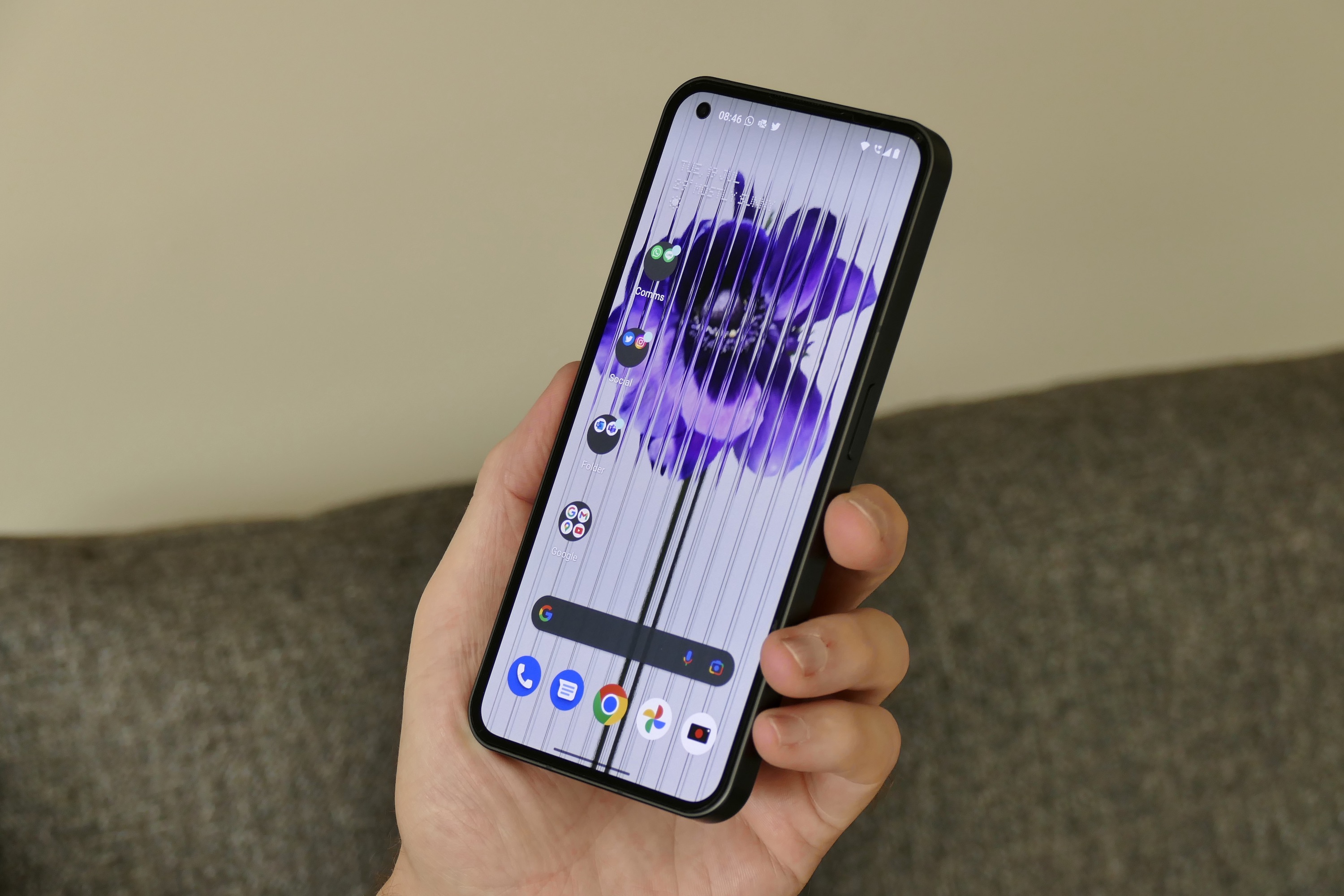
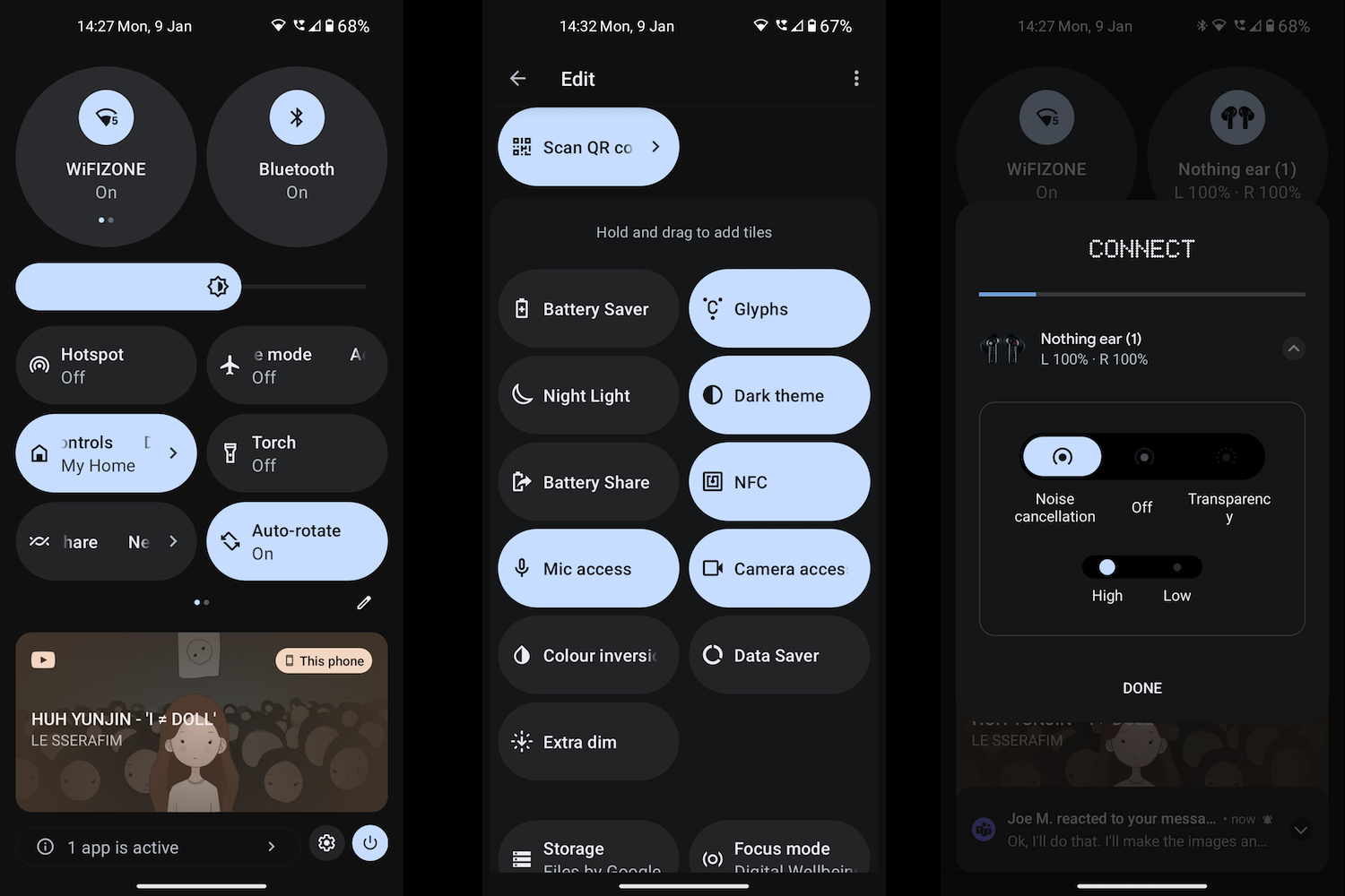
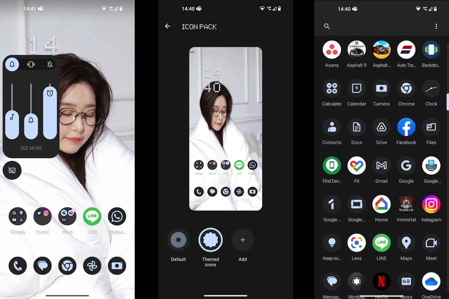
The design is clean and quite similar to Android on the Pixel, apart from a few little additions made by Nothing. For example, there are four different Nothing clock widgets and a pair of large multifunction connectivity panels under Quick Settings. If you were worried Nothing was going to cover NothingOS in its pixel-themed font, then don’t be. It’s all rather normal.
Using the Nothing Phone 1 is comfortable, effortless, and satisfying. You quickly fall into a rhythm with the phone, something that takes time on phones with more complicated, attention-seeking software. It’s not without fault or quirks, but most of them are only small annoyances. Several software updates since launch have cured many, including being able to remove the Google Search bar from the home screen. Considering this is Nothing’s first phone, it has done a very impressive job with the software overall, which I haven’t wanted to stop using.
One improvement is when you connect Nothing’s earbuds to the phone. Using the Nothing X plug-on the noise cancelation can be switched under the Quick Settings menu, and connection was also extremely fast. The integration is exactly what we were promised from the start, and is a good reason to buy the Ear 1’s with the phone. You can try NothingOS out on your own phone right now by using the NothingOS launcher app, and it’s very close to the software on the phone in terms of design.
Nothing Phone 1 performance and screen
The Nothing Phone 1 uses a Qualcomm Snapdragon 778G+ processor, and my review model has 8GB of RAM and 256GB of storage space. The phone has no issue with general tasks, whether it’s keeping up with the GPS when using it for navigation in a car, using social media apps, or using the camera. The combination of NothingOS, the chip, and the 120Hz screen means the Phone 1 always feels smooth and responsive.
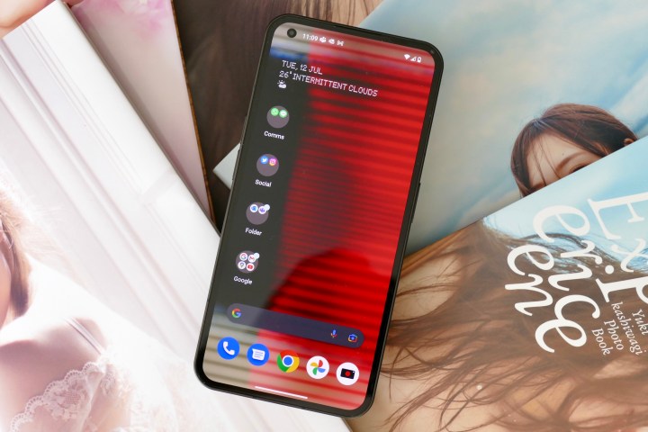
It’s when you play games that the processor starts to struggle, and it generates some heat when it does. Play Asphalt 9: Legends or Diablo Immortal, and there’s a noticeable buildup of heat on the back of the phone. It doesn’t get too hot to hold, but you definitely get the impression the phone is working hard. Heat was also an issue on the Xiaomi 12 Lite, which also uses a Snapdragon 778 processor.
The combination of NothingOS, the chip, and the 120Hz screen means the Phone 1 always feels smooth and responsive.
On the front of the Nothing Phone 1 is a 6.55-inch OLED screen with a 2400 x 1080 pixel resolution, 10-bit color, HDR10+ certification, a 240Hz touch-sampling rate, and a maximum 120Hz refresh rate. Out of the box, the phone defaults to 60Hz, but you should change this immediately. Switching to 120Hz makes the noticeable blur when scrolling disappears, and it operates in the places you want it: in apps like Twitter, in Google Discover, and when browsing in Chrome.
I love the way the flexible OLED panel is so close to the glass and the equal-sized bezels around it. It gives the Phone 1 a modern, uniform look. The viewing angles are also very good, and for the most part, the screen is visible and usable in sunlight. Much like the camera, the screen’s tone, color balance, and overall performance has been tuned to match the iPhone. Putting it alongside the iPhone 13 Pro, there’s almost nothing to separate them, as each has the same natural look, with outstanding detail in shadows and bright, vibrant colors.

It’s different from the usual screen performance on an Android phone, particularly on phones that use Samsung panels, which usually up the contrast for a higher degree of saturation at the expense of detail. Personally, I prefer the iPhone’s screen performance, so the Nothing Phone 1 suits me. However, the speakers let the phone down — although it’s stereo sound, it’s harsh and tinny at anything other than low volume.
Nothing Phone 1 battery and charging
The Nothing Phone 1 does not come with a charger, but a USB cable is included in the box. This leaves you at the mercy of the chargers you already own. I used a USB Type-C charger that claims to fast charge to Qualcomm Quick Charge 3 standards, and the phone showed “Charging Rapidly” on the screen. In 10 minutes, the battery went from 2% to 20%. After 30 minutes, it was at 55% and was fully charged in a little over an hour.

Wireless charging is available, as you can see through the transparent back panel, but at 15 watts, it’s definitely not going to be faster than the wired option. You can also reverse charge at 5W. As you’d expect, the Nothing Ear 1 true wireless earbuds are compatible, as are the Samsung Galaxy Buds Live and the Apple AirPods Pro. When you place a device down on the back of the phone to charge, the central Glyph light illuminates for a few seconds to confirm the power is flowing.
Charging, compared to many other competing devices at this price, is underwhelming on the Nothing Phone 1, as is the battery life in general. Moderately heavy use — one hour of gaming or GPS, emails, social media, and photography — while connected to a 4G or 5G signal will see the battery struggle to last a single, long day. Play 30 minutes of games like Diablo Immortal with the default settings, and expect the battery to fall by about 8%.
Even with careful use, I haven’t gotten two full days out of the Nothing Phone 1’s battery. It’s fine provided you charge every night, but if you regularly play a lot of games or push the phone in other ways, then don’t expect any more than a full day, maximum.
Using the Nothing Phone 1 in 2023 with Android 13

Returning to the Nothing Phone 1 at the beginning of 2023, I’ve been using the Android 13-based Nothing OS 1.5 beta software for a week. I have not noticed any obvious bugs that affect my daily use, in that apps run as expected and notifications arrive. I came from the Pixel 7 Pro, and appreciate the design decisions that have been made which keep it very close to Android on Google’s phone.
How about the camera? The inconsistency noted in my original review and my update six weeks after release remains, with the main camera and wide-angle camera only sometimes taking a similar-looking photo. It stumbles with exposure when you take a photo quickly after opening the app too, but this may be down to the beta software. The camera can take great photos, but it can take disappointing ones too. The gallery below shows photos taken in 2023 with the phone running Nothing OS 1.5.
Battery life remains average, and perhaps even a little worse than before, with a 30-minute gaming session taking at least 10%, and even moderate use during a day seeing the battery drop below 50% by mid-evening. All this means the Nothing Phone 1 still needs recharging every night if you want to be assured it’ll last through a second day.
There are a few odd things in the beta, with WhatsApp refusing to immediately show the latest photos when I go to share something being the most annoying. Part of the Android 13 update is a new weather app, which takes on the Nothing “pixel-art” design style it has been associated with since the beginning. It’s definitely a fun design, but it’s still just a weather app, and the Home screen widget hasn’t been altered for it to really show the design off.
Time, and the Nothing OS 1.5 software, have not transformed the Nothing Phone 1. It’s still a very good phone, with more positives than negatives, and I certainly haven’t felt the need to remove my SIM and jump to another phone. It also remains unchallenged for anyone wanting a reasonably priced phone with some character, and not one that looks the same as all the rest.
Nothing Phone 1 price and availability
The Nothing Phone 1 won’t be released in the U.S., which it says is due to it being a new brand, and striking up relationships with carriers in the U.S. is unrealistic at this stage. However, Nothing does want to release a phone in the U.S. in the future. For now, the Nothing Phone 1 is available to buy in the U.K., parts of Europe, India, Japan, and elsewhere.
In the U.K., the Phone 1 starts at 399 British pounds ($473) for the 8GB/128GB version and 449 pounds ($533) for the 8GB/256GB model. The top model is a 12GB/256GB version for 499 pounds ($592). Nothing will sell the phone through its own online store, the O2 network, and retail partners (including Selfridges).
The Nothing Phone 1 is quirky and enjoyable
Quirky, individual, and enjoyable to use, the Nothing Phone 1 succeeds in being different from any other smartphone, at least on the outside. Inside, things are substantially more familiar, with the software sharing plenty of stylistic and interface similarities with the Google Pixel series. It’s reasonably priced, the specifications are good, the software is enjoyable to use, and it really does look and feel different from any other Android phone out there.
However, it’s not perfect. The camera hasn’t been dramatically improved since its release, and the battery life is quite short. The Android 13-based Nothing OS 1.5 software is in beta now, with a full release promised for early 2023. This is good news, but don’t expect the software to transform the phone, and the late arrival puts it behind rivals from Samsung and Google. Don’t let it really put you off though, as the Nothing Phone 1 is a recommended buy and a very exciting start for the company.

